Squidoo CSS: multi-column text

CSS3 multiple columns
You can divide long text snippets into multiple columns with a simple CSS trick. It's not difficult, and it can be customized in a plenty of ways.
In this lens I'll show you how to do it, step by step. You don't need any knowledge of HTML or CSS. I'll also discuss why this CSS trick can be useful.
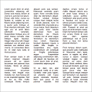
Preview
This text is divided into two columns. You can divide text into more columns as well: three, four, five, and so on. If you are applying this CSS trick into your Squidoo lens, I recommend using no more than three columns. Too many columns look ugly and the text will become unreadable.
See the grey line between the columns? You can change its thickness, its color, its style, and you can completely get rid of it. I'll show you later how.
Can't see any columns but just one big piece of text? Then you are most probably using an outdated web browser. I recommend getting a newer one. Modern browsers are not only free, but they also provide better functionality, more pleasant browsing experience, and more advanced protection against security risks. I recommend getting either Google Chrome (my choice) or Mozilla Firefox (this is good as well). They are both free.
So, if you can't see any columns, click here to see a picture how this text should look like.
How: the basics
Below is a basic code for two column CSS code. If you want to immediately deploy this CSS trick, please feel free to do so. However, if you want to know how to modify it, please continue reading this lens.
Copy the code snippet below and paste it into your module. Change only the text that is green in the code snippet below.
Your text here. Don't change the blue text. Only green.How: number of columns
Change the red numbers below to change the number of columns. By default the number is two. You can try three and even four, but please, don't be greedy. A five column paragraph doesn't look good.
2
; -moz-column-gap: 40px; -moz-column-rule: 1px solid #c4c8cc; -webkit-column-count: 2; -webkit-column-gap: 40px; -webkit-column-rule: 1px solid #c4c8cc; column-count: 2; column-gap: 40px; column-rule: 1px solid #c4c8cc;">Your text here. Don't change the blue text. Only green and red.A five column paragraph doesn't look good.
Lorem ipsum dolor sit amet, consectetur adipiscing elit. Donec erat massa, dictum at viverra in, pulvinar non ipsum. Donec odio tortor, cursus eu facilisis id, sodales ac est. Mauris iaculis adipiscing nunc, a auctor justo tristique ut. Proin interdum nibh justo. Sed eget orci sit amet libero sollicitudin venenatis. Suspendisse tristique arcu sit amet massa convallis vitae tristique ligula faucibus. Integer vitae urna velit. Integer vestibulum orci sit amet eros interdum non eleifend dolor viverra. Ut consectetur libero mi. Ut vitae nunc nulla, id rhoncus purus.
How: the gap between columns
You can change the width of the gap between columns by changing the red text. By default it's 40 pixels, which is an ideal width.
40px
; -moz-column-rule: 1px solid #c4c8cc; -webkit-column-count: 2; -webkit-column-gap: 40px; -webkit-column-rule: 1px solid #c4c8cc; column-count: 2; column-gap: 40px; column-rule: 1px solid #c4c8cc;">Your text here. Don't change the blue text. Only green and red.The gap between these paragraphs is now 20 pixels (20px). Lorem ipsum dolor sit amet, consectetur adipiscing elit. Suspendisse elementum, eros ac pretium condimentum, orci odio rhoncus augue, posuere fringilla ipsum diam fringilla augue. Curabitur nec pellentesque ante. Morbi iaculis lacus quis justo vulputate semper.
How: the line between columns
You can change the thickness, color, and style of the line between columns. You can also get rid of it. Change the red text like this:
- 1Thickness
Change the first value. By default it's 1px, you can try e.g. 3px.
- 2Style
Change the second value. By default it's solid, you can try e.g. dotted. Click here to see available styles.
- 3Color
Change the third value. By default it's #c4c8cc (light grey). Either write a name of a color (e.g. red or blue), or a hex color code (e.g. #f4656f (pink)). (Psst...be sure to check out my lens Funny Hex Colors.)
1px solid #c4c8cc
; -webkit-column-count: 2; -webkit-column-gap: 40px; -webkit-column-rule: 1px solid #c4c8cc; column-count: 2; column-gap: 40px; column-rule: 1px solid #c4c8cc;">Your text here. Don't change the blue text. Only green and red.My gap line is 3px dashed #b59290. Lorem ipsum dolor sit amet, consectetur adipiscing elit. Suspendisse elementum, eros ac pretium condimentum, orci odio rhoncus augue, posuere fringilla ipsum diam fringilla augue. Curabitur nec pellentesque ante. Morbi iaculis lacus quis justo vulputate semper.
- 4Getting rid of the line
Remove the red text.
-moz-column-rule: 1px solid #c4c8cc;
-webkit-column-count: 2; -webkit-column-gap: 40px; -webkit-column-rule: 1px solid #c4c8cc; column-count: 2; column-gap: 40px; column-rule: 1px solid #c4c8cc;">Your text here. Don't change the blue text. Only green and red.My gap doesn't have a line at all! Lorem ipsum dolor sit amet, consectetur adipiscing elit. Suspendisse elementum, eros ac pretium condimentum, orci odio rhoncus augue, posuere fringilla ipsum diam fringilla augue. Curabitur nec pellentesque ante. Morbi iaculis lacus quis justo vulputate semper.
That's a wrap!
Did you get it? Now you (should) know how to do the multi-column text CSS trick. Please vote below and please be honest. If you have questions, be sure to ask me. There's a guestbook at the bottom of this lens.
Did you understand?
Want more CSS?
The book below is a must for you if you want to learn CSS. If you want to, you'd better also learn HTML. CSS and HTML go together, hand in hand.


Was this CSS trick useful? Are you already using it? Link to your lens using this CSS trick below, and feel free to add other comments as well!
HTML is allowed, spamming is not. Comments are moderated.


